World leading living laboratory in Central Scotland
A world-leading living laboratory in Central Scotland
A state-of-the-art environmental monitoring system enables organisations to use real-time data for faster, better decisions.
key results
- Prove the technical feasability of collecting data from multiple remote sources over a 5G network
- Demonstrate the value of data sharing in a publicly available platform
The Forth Environmental Resilience Array (Forth-ERA) project is a partnership between Stirling University and the BT Group. The partnership works with regional stakeholders from the public and private sector, using EE’s 5G network to capture data from sensors across the region. The cross disciplinary approach – bringing together science, research, business and regulation – is promoted by experts as a global exemplar of green recovery that can be easily scaled and replicated world wide.
Phase one of the project brings together a combination of real-time data from sensors located across the Forth Valley to monitor water quality in drinking water reservoirs, near real time forecasts of bathing water quality, provide early warning and monitoring of floods, and provide real time data on water temperature to help inform the brewing and distilling sector.
The data gathered from these sensors is enhanced with data from other stakeholders, as well as publicly available data from The Met Office and the UK Hydrographic Office and satellite imagery from the European Space Agency’s Copernicus satellites.
the solution
When it came to bringing data from disparate sources together in one easily accessible place, and displaying in intuitive ways that will meet the needs of a diverse user base, UoS and BT turned to us.
We worked with BT engineers to connect our visualisation platform to their Data Hub – the underlying architecture that supports their digital fabric solution. Through this data hub, we capture the live data from a range of water sensors, weather stations and CCTV cameras located at various points around the Forth Estuary, and along the path of the River Leven from the loch down to its meeting point with the River Forth.
Data from The Met Office and the UKHO is made available to the general public through published API’s (Application Programming Interface). Likewise, ESA make data from satellites available to organisations on request through their own set of API’s. These API’s make it relatively simple for us to bring new information into the platform as soon as it is available.
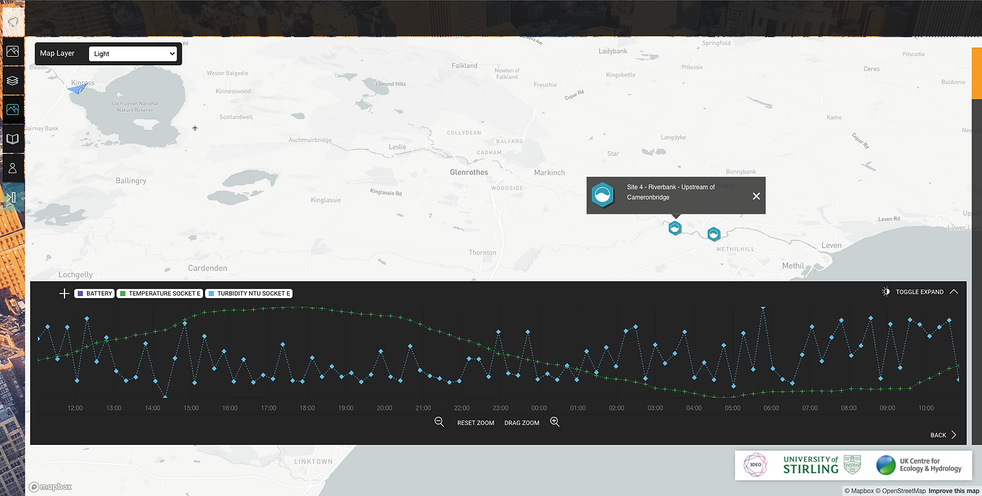
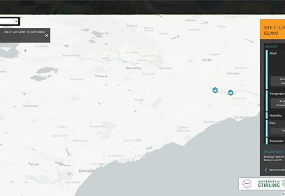
Each sensor is geo-located on the map, and highlighted with icons representing the purpose of the device. In the case of the weather sensor, we went one better, placing a rotating icon in position on the map to show the wind direction live. The weather sensor also provides a range of measurements including barometric pressure, temperature and rainfall, so the icon is configurable, allowing users can choose the measurement that they are most interested in seeing first.
Users access the information from the devices through a pop-up panel that appears when an individual icon is clicked. Although the devices come from different manufacturers and send data in different formats, this is completely transparent to the end user. Information is presented in the same familiar style, making it much easier to consume.
In addition to live data, users are also able to view the last 24 hours of data in a configurable graph that can be manipulated to show the different measures available from each sensor.
The CCTV cameras add the ability to pop the image out, and show a picture-in-picture over the live map – useful for observing to understand changes at the site that might cause a change in sensor readings.
The presentation of data is crucial to the success of the application. We worked with users to understand their use cases, and find the best ways to present the data in ways that are familiar to them. While some users prefer to see data in charts and graphs, others respond to more visual representation, for example using colour gradients and size. The wind sensor is a great example of this. The moving icon can grow in size or change in colour depending on gust strength, but this can also be shown on a chart.
For the visualisation of satellite images, we drew on previous experience with Stirling University to overlay the image on the map in the exact position of the body of water. Where a user would normally view the stand-alone image, they can now see it in the context of the surrounding area. The addition of live data from co-located sensors/cameras and forecast data from third parties now gives a view into the past, the present and the ability to evaluate what might happen in the near future.
The goal of this project was to demonstrate how the individual elements could be pulled together to create a platform that delivers real-time information to anyone, anywhere. With that goal successfully achieved, we’re looking forward to working with the partnership on the second phase.


